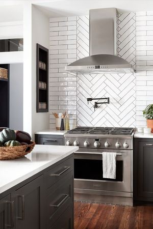
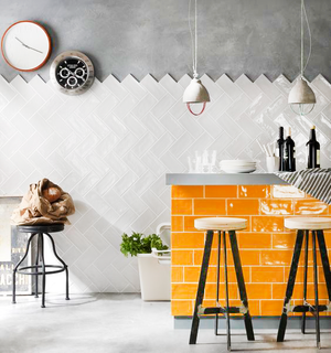
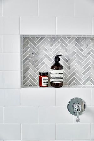
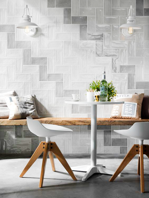
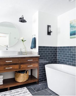
Originated by designers George C. Heins and Christopher Grant La Farge, this 3-by-6-inch rectangle was first seen in a New York subway station. The tiles moved as quickly as the subway into bathrooms and kitchens across the country. Bright, easy to clean, and sleek, subway tiles work in the running bond pattern or in unexpected herringbone patterns. We love mixing it up. Diagonal offsets and crosshatches, vertical bond, you name it-- we've never met a subway tile that we didn't like.

CDB Interiors Lifestyle Blog
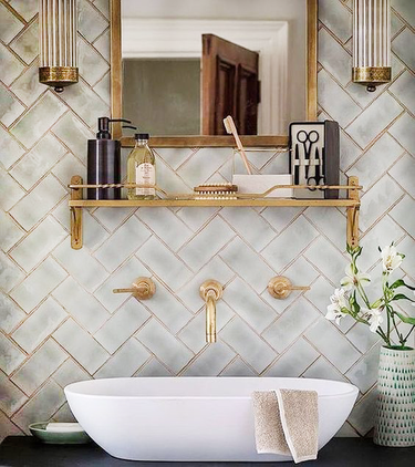
Subway Tile

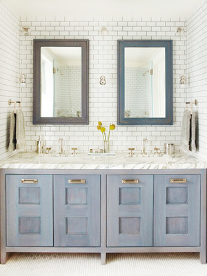
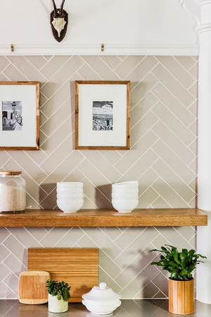
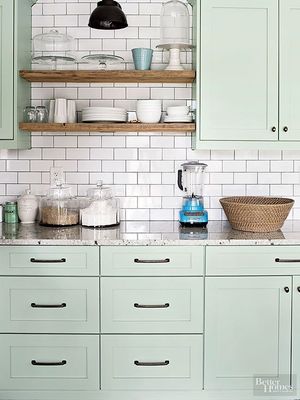
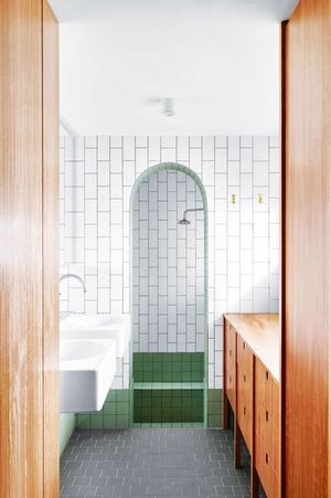
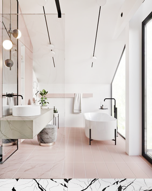
Clean and classic, subway tiles have stood the test of time. They reflect light well, making spaces brighter and seem larger. Classic white with lighter grout blends, while a darker grout has a warmer feel and brings out the design decided on. Speaking of design, we love thinking outside the horizontal box too. Herringbone, vertical stack, offset-- you name it, we are placing any and all formats #OnthePedestal!
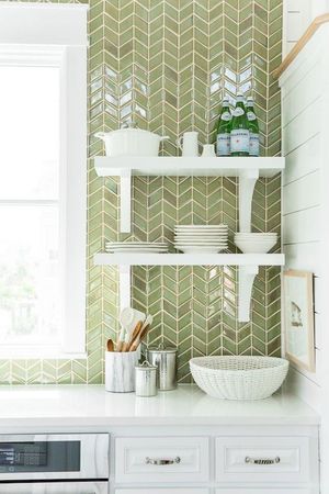
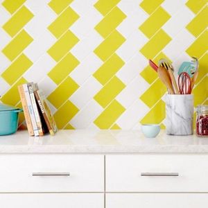

Don't let the classic design prohibit you from having a little fun! Color works with this usually-white tile as well. Not ready to go all the way? Subway tile accent walls look amazing. Showers and backsplashes go great with our tile crush!
