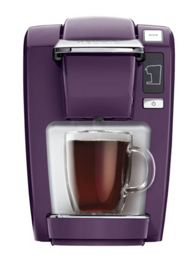
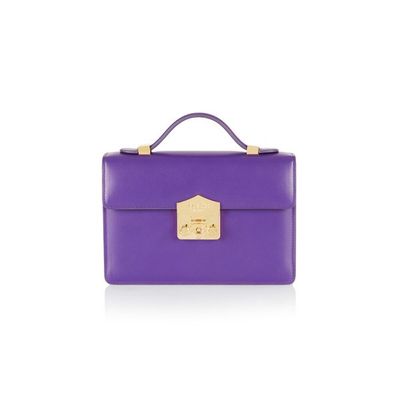
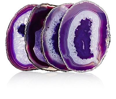
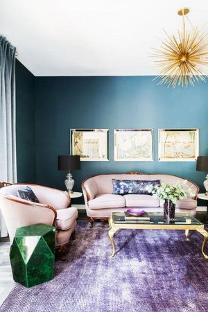
It's regal. It's royal. It's in-your-face bold and yet, not aggressive. It's Pantone's Color of the Year. We see color making it's way across the fashion world, but fashion and interior design have a way of holding hands while telling their stories.

CDB Interiors Lifestyle Blog
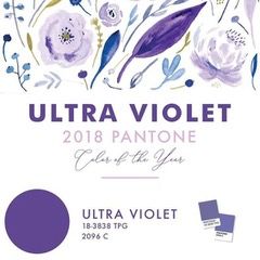
Color of the Year 2018
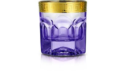
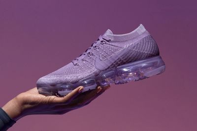
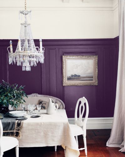
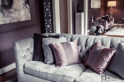
Case in point: ultraviolet Nikes and the gorgeous purple wainscoating. Neutral-lovers needn’t worry, either. This color is as wearable as it is functional. Gem tones, like our leading lady ultra violet, tends to be far more functional than it seems at first gloss. Speaking of gloss, this color works well as a matte shade or with a high sheen to it. Rich and full of depth, ultra violet glasses would spice up any bar or tablescape. Ultra Violet goes well in any light and any neutral: light pine or a dark, rustic farmhouse, to a carrera marble. This shade is diverse and does the work with the stark white contrast, the deep jewel tone brings the eye up and elongates the room while also highlighting the gorgeous white furniture.
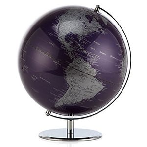
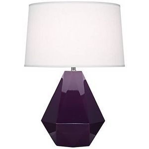
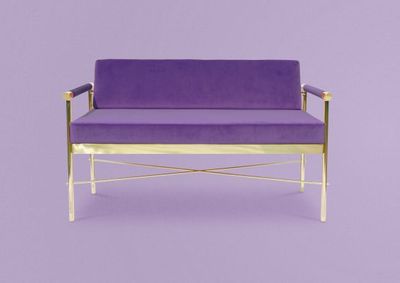
We’ve taken a special notice to this regal shade worn or decorated with depth. Whether is suede, velvet, crocodile, or faux fur, our plum hue translates in all textiles. In fact, it’s far richer and more intriguing when the tonal depth is brought out by textile richness. Not ready to commit fully and go grape? Add details of this rich shade like the delicious Z Gallerie globe or Robert Abbey Delta's Amethyst lamp. We can’t wait to see where ultra violet makes a splash this year, but we are certain it will be fit for a queen.
